My project was to create an opening sequence to a film, I worked with three other people , Charina Clarkson, Rebecca Thorburn and Hannah Greenfield. I mainly contributed in the the pre-production, doing research on other films and characters. Also in the production stage by directing.
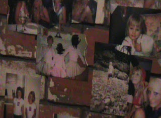
1. For my media project I decided to create the opening sequence for a film, along with three other people. The genre that we choose was going to be Horror. We researched some of the main conventions of the horror genre and used it within the sequence. These conventions are for instance an intense and disturbing atmosphere with the use of sound effects. The props, lighting and camera angles are usually in the opening sequence of any film to give the audience to give different enigmas. Also in the opening sequence it has to give a time and place in which the film is set and also to give character detail. For instance in my opening sequence, we have used images on a wall of the main characters to gather enigmas of what they look like, their age and the fact that they are possibly being watched or already captured.
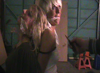
2. The particular social group that my opening sequence represents is teenagers. In the first clip of the sequence, we see lots of images of two girls that are on a brick wall, the images of the two girls show that they are teenagers. The social stereotype that are usually put in horror teen films are helpless and defenseless teenage girls which are commonly used in the media. This is because females are seen as the weaker sex and teenagers can relate to the situation because it happens in real-life, this makes the audience more interested and keeps them hooked to see what happens.
The costume of the two female characters are the the same as other young adults such as fashionable, everyday clothing. The setting of the sequence is in an old run down garage, these types of derelict scenes are usually seen within this genre for the teen audience. There is no speech within the sequence, however at the end one of the girls scream which is very stereotypical and represents the female population like many other teen horror films.
3. The main distributor that have put money behind similar films are Miramax, this film company are responsible for movies such as Scream, Halloween H20 and The Crow. All of these films are famous teenage horror films that gather a similar audience to my media product. I believe that this company would back up my product because they have a lot of similar teen films that they have distributed too and have a particular audience that watch their films and will keep that audience watching their films with another one such-like ones before.
4. The audience for my media product would be teenagers, particularly ages 16-15. A students socio-economic status would be E because they do not have any full-time job at this point and have the lowest income. Also, the audience for my media product could also include people who have a certain interest in one specific genre.
I believe that this is a good audience because teenagers, statistically, spend more money at the cinemas than any other age group. Therefore, more profit would be made and also potentially a larger mass audience. A secondary audience for my media product would possibly be parents. They may want to view the film before their son or daughter will watch it.
From my audience feedback sheet my product gained a positive and negative reaction from the target audience.
Do you think the age certificate fits with the genre?
1.No it should be an 18.
2.Yes, there is no bloody violence.
5. To attract the target audience we had to create a narrative to give the basic information of the film without giving too much away. At the start of the sequence we set up the understanding of the characters, such as sex, age and their appearance. Later in the sequence they are shown and the audience understood that the photos on the brick wall were of the two girls that had been captured.

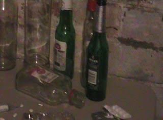
We had to make sure that the sense of place and time was made clear within the few seconds of the opening sequence. This happened from the dark lighting that was used to create the sense of being during the night but also being able to see the derelict surrounding. During the sequence we made sure that there were lots of different enigmas to keep the audience hooked. Some of these were showing pictures on the wall of the girl, the panning shot of the table with alcohol and drugs and also the knifes that the killer laid out very neatly in a particular order.
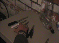
When the killer lays out the knifes very neatly and all in order by size, it creates a conflict within the situation and makes the audience think that something isn't right with the man and that something is going to happen to the female characters in the photos. Tension is built within the start to the end of the sequence from the non-dietetic sound. The sound creates suspense and gives a chilling feel to the audience.
The messages that the opening sequence suggests are for teenagers to try and stay safe and tell somebody where you are going because anything can happen even if its only ten minutes on your own. This message is very effective within the sequence because the audience can relate to the message and realise that it can actually happen and has happened in the past.
The number of stars in the media project has on three, mainly because the opening sequence shouldn't include too many or the audience will become confused and not understand the narrative of the rest of the film. Non- dietetic sound has been used throughout the entire opening sequence to get the feel of the genre, this creates and intense and scary atmosphere. The mise-en-scene of the opening sequence includes such things like bottles of alcohol, brick wall, gags, rope, light switch and knifes. We made sure that everything in the frame was cold and chilling to make sure that the right atmosphere was created.
The panning shot at the beginning of the sequence was used to give the audience a sense of the place and the narrative of the film from showing the photographs on the wall. Several shots of the photograph being cut but the male character were used within the sequence, we used a birds eye view shot, then a side shot of the picture falling on the table after being cut then a point of view shot of the man sticking the cut out photograph onto the wall. The editing pace of the opening sequence is quite slow, this was done to make an intense, chilling effect of not knowing what is going to happen next.
6. The use of technology has helped a great deal within the project, for instance, to help me research for the blog I had to look on in internet for useful sites such as youtube.com, blogger.com and other useful sites that I could use for research. By using the internet it has allowed me to embed video clips onto the blog so that my visual aspects could be seen and understood.
Over the course of this project I have learned to use equipment such as cameras and software for editing. Being able to use the software has let me be able to cut clips, add music, add different effects, slow or speed up clips and also add and change titles. Some of the shots that we had taken had to be re shot, this was because the lighting was wrong on some of the clips and also the speed of the panning shot was too fast.
7. Looking back at the preliminary task, I believe that progression has been made has been better. For instance, I have learnt to use different camera angle within one scene and being able to edit and cut clips to make sure its correct. Also to create the right lighting which will not create shadows on the camera.
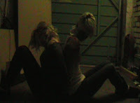
In conclusion I believe that there have been many strengths throughout the product, some of these are the sound that was used creates the right atmosphere and genre for the sequence. Also the lighting when the two characters are tied together and the lights flicker on which creates a scary effect to the opening sequence. The panning shot that was used at the first part of the sequence worked very well because it created several enigmas. However there were some weaknesses, one of these was the fact that we had to re-shoot the panning shot several times to make sure the lighting was correct which was very time consuming. For example, on picture shot to the light switch shot the light is different.


 An over the shoulder shot of the villain and his knifes, a point-of-view shot of the light switch,


 The two protagonists are mainly shown in three point lighting to balance out he shot as they are placed in the centre, this shows their innocence and vulnerability.
 The characters movement throughout the short lasting sequence is very slow as it is just the opening, trying to set up a sense of time and place. The slow panning shot which is slow and deliberate also reflects the villain’s mental state as we see this through his actions.